
 Loading...
The name Faphouse already gives you a pretty good hint about what kind of place it is. The site focuses on high-quality adult videos and clearly tries to present itself as something a bit more polished than a random tube page. One thing that becomes obvious almost immediately is the attention to video quality. A lot of the clips appear in HD, and some of them even come in full 4K. The masturbation section is only one small part of the platform, but there’s still plenty of content there to keep someone busy for a while.
After spending a little time scrolling through the page, it’s clear the category isn’t limited to just one style of video. It’s not only simple solo scenes. Many clips start that way but then move into other kinds of interactions. Because of that, the section feels a bit broader than what you normally expect from a typical masturbation category.
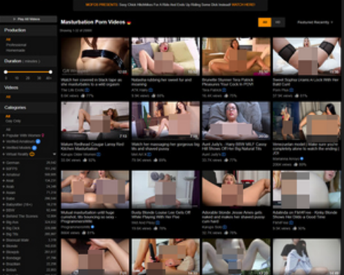
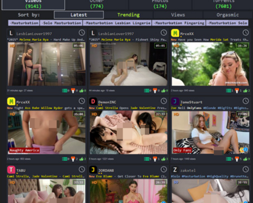
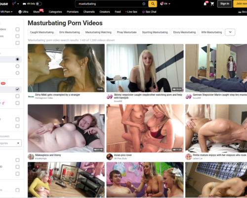
The layout of the page is simple enough to understand right away. Videos are arranged in rows across the screen, several thumbnails per line, so you can move through the page fairly quickly without opening dozens of tabs. Each thumbnail already shows a few important details like the title, the length of the video, and the quality. If you hover the cursor over a clip, a short silent preview usually starts playing. It’s a small touch, but it helps when you’re deciding whether the video looks interesting enough to open.
There’s also a filtering panel sitting on the side of the page. The options themselves are nothing unusual, but they help when the number of videos starts feeling overwhelming. Instead of endlessly scrolling through everything, you can narrow the results and focus on something specific. The only small downside is that the sidebar takes up quite a bit of space on a desktop screen.
On phones the layout works a little differently. The filters are hidden behind a button instead of being permanently visible. Tap the button and the menu slides open, letting you adjust the sorting options. It keeps the screen cleaner and gives more space to the videos themselves.
When you open a specific clip, the video player sits right in the center of the page. Around it you’ll find tags, titles, and details about the studio behind the video. Other suggested clips appear nearby, so it’s easy to jump to another video once the current one ends.
One thing I liked while browsing was the preview system. Instead of showing just a static thumbnail, many clips include a short preview that starts playing automatically. That alone makes browsing much easier because you can quickly see what the video looks like without committing to opening it.
In general, the whole site feels built for easy browsing. The thumbnails are clear, previews help you decide faster, and the filtering tools make it easier to move through the large library of videos. The desktop version could probably use a slightly smaller sidebar so more clips fit on the screen, but aside from that the platform runs smoothly, especially when viewed from a phone.